Category: Branding
Type: School Client Project
Year: 2020
Collaborators/My role:
Research, Ideation: with Bhavya Grover
Sketch, Development: Individual Work
Type: School Client Project
Year: 2020
Collaborators/My role:
Research, Ideation: with Bhavya Grover
Sketch, Development: Individual Work
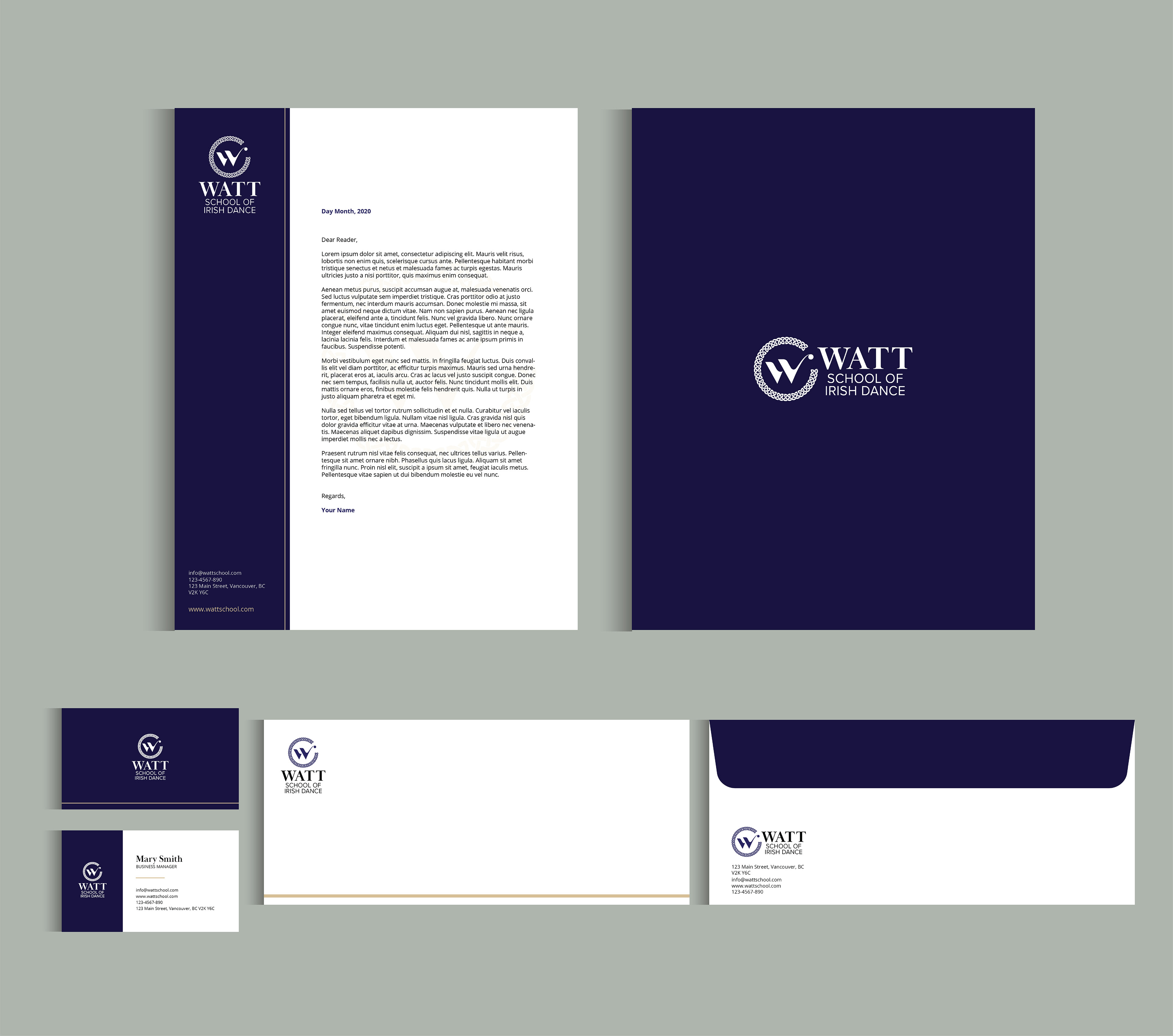
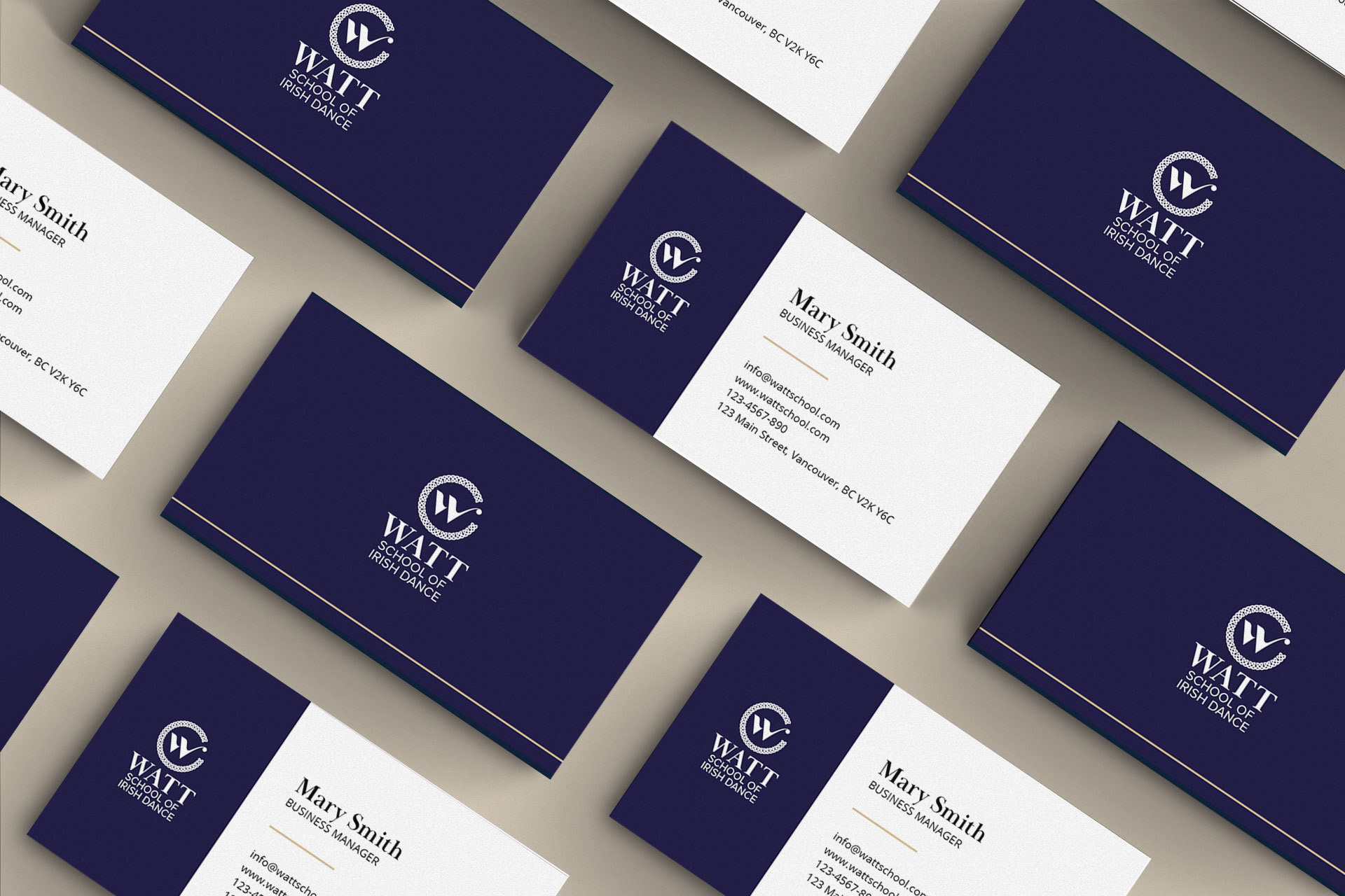
During my College studio class, we had a real client Wat School of Irish Dance that is a prize-winning dance school offering competitive classes. The project goal was to redesign their logo and stationaries.
They have used their current logo since 1985 and it looks dated and busy with many elements. They are looking for a new brand identity with a modern and clean looking to attract more people and get new students.
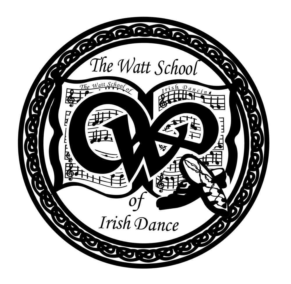
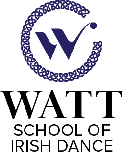
Old logo and new logo
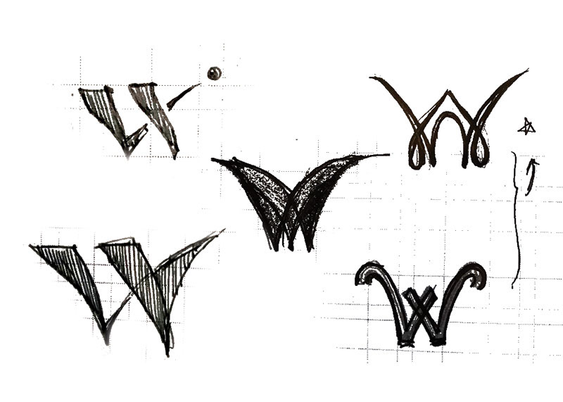
Sketch
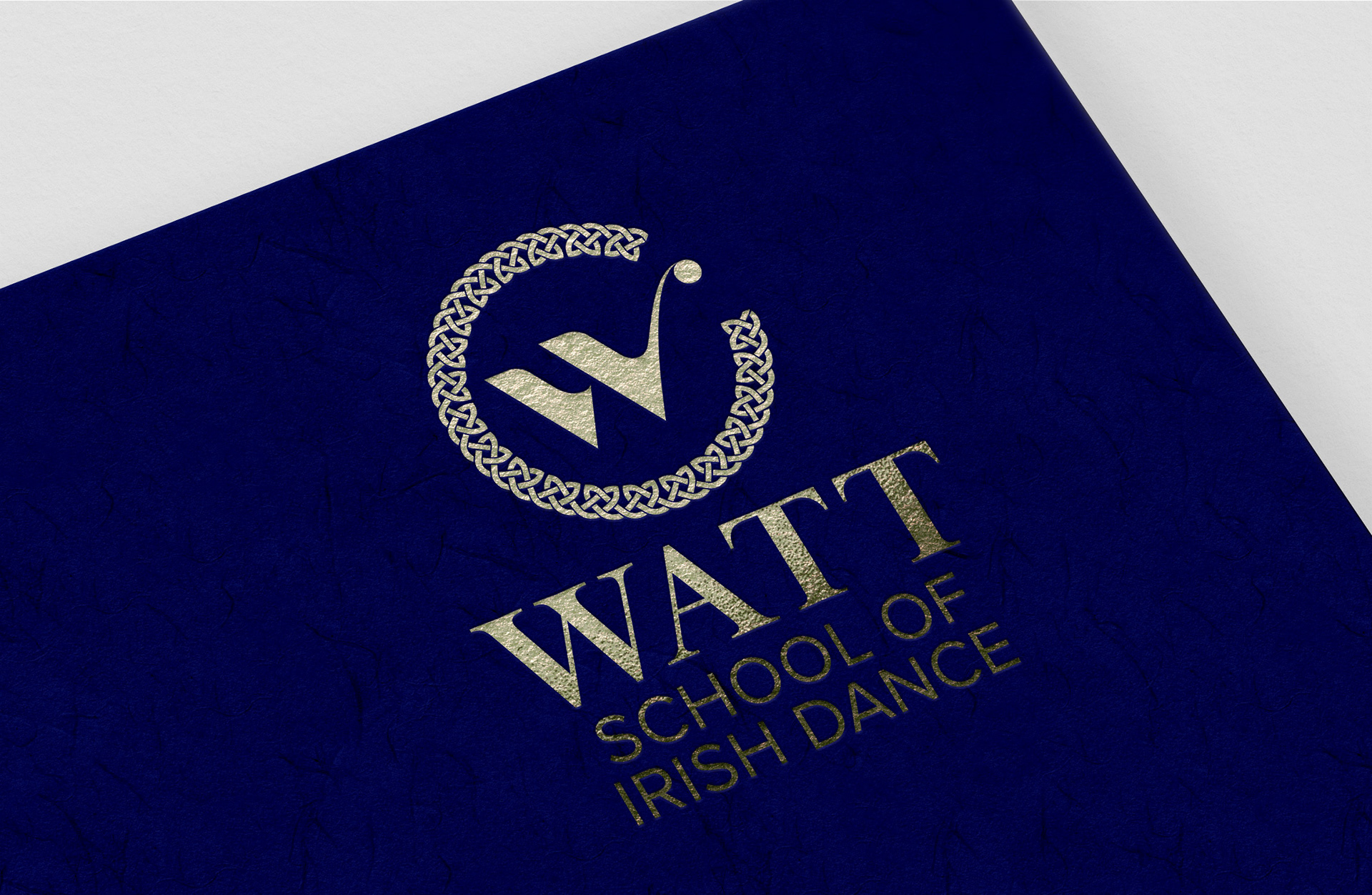
Through the interview with the client, I clarified a message and concepts to be communicated. My message is ‘Modelling excellence in competitive Irish dancers.’ and I had three concepts: Legacy, Body movement and High aiming. I created a lot of sketches to represent the concepts and chose one direction. The ‘W‘ letter shape consists of two strong legs movement.
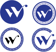
The main challenge was to preserve both the modern look concept as well as a strong feeling of legacy. The Celtic knot pattern could have presented an issue of an outdated look and had to
be dealt with carefully.
be dealt with carefully.
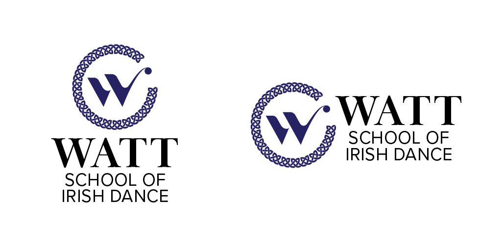
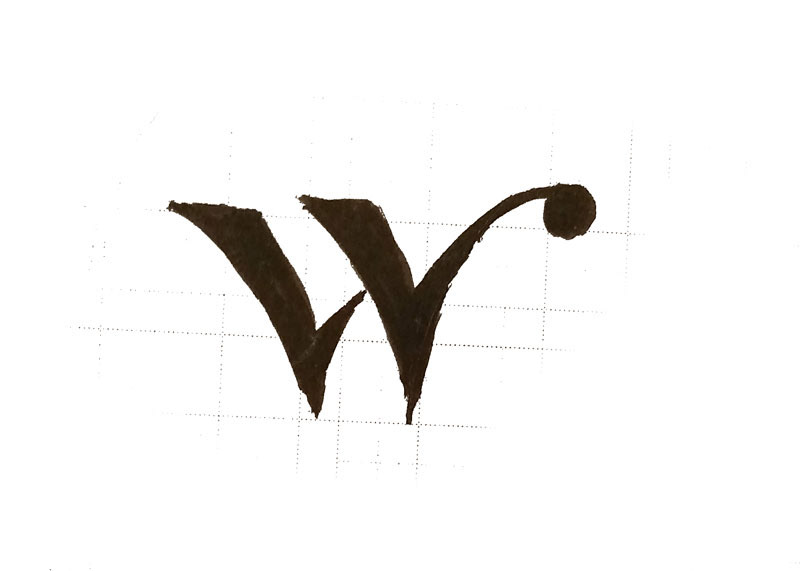
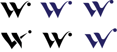
My final logo is inspired by the strong motive of the traditional Irish dancers. The coexistence of the sharp and curvy lines represents the athletic and elegant style of Irish dance with the staccato rhythms. The long stroke partnered with the circle in the top right of the outer frame represents that
Watt school is always striving for the best.
Watt school is always striving for the best.